
"A CUP ABOVE THE REST"
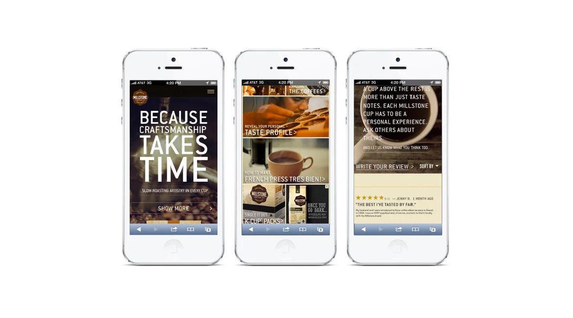
A CUP ABOVE THE REST. MILLSTONE INTRODUCED THEIR NEW PACKAGING, GIVING WAY TO COMPLETELY REDESIGN THEIR LOOK-AND-FEEL AND TONE OF VOICE – STARTING WITH THEIR WEBSITE EXPERIENCE.
To reposition Millstone as a super-premium, yet approachable coffee brand, we defined a visual vocabulary that extends the packaging’s aesthetic into an emotionally-charged, online experience.
Image-driven storytelling, beautiful, large-scale photography, full-screen video, rich, vibrant, clean, powerful, responsive design. A simple, uncluttered aesthetic creates a memorable user experience, allowing our products and process to be the hero on every screen—while supporting the new brand message: “A cup above the rest.”
ROLE :
UX Strategy
UI Design
Creative Collaboration
Tech Collaboration
DELIVERY :
Competitive Audit
Persona Development
Site Architecture
Responsive Wireframes
Clickable Prototypes
BazaarVoice® Integration Strategy
Video Concepts & Storyboarding
Email Campaign Redesign
Social Media Promotions
Site Architecture
Competitive Benchmarking
Influencer Map: Persona Development
Responsive Wireframes and Email Template